Our Vision,Your Reality!
Tailored Designs

CNC Cutting
Inspiration
Our design captures the precision of CNC cutting with clean and crisp presentation, a simplistic UI providing easy navigation and an engaging image that draws the eye to the company name and tagline.
Fonts
Beautifully Delicious, Balgin
Palette
Red tones, White and Dark Grey
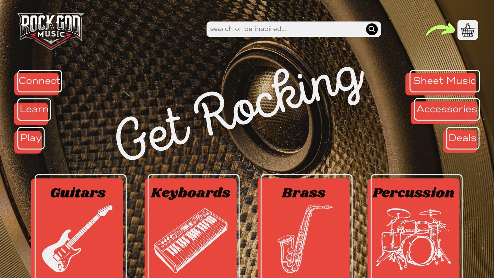
Rock God Music
Inspiration
A nostalgic nod to the golden era of rock and roll in the 1950s with the use of fonts and styling that wouldn’t be out of place on a billboard in Memphis. The backdrop of a modern speaker is added to emphasise music being timeless.
Fonts
Shrikhand, Intro Script, Gabriel Sans
Palette
Red, Black and White
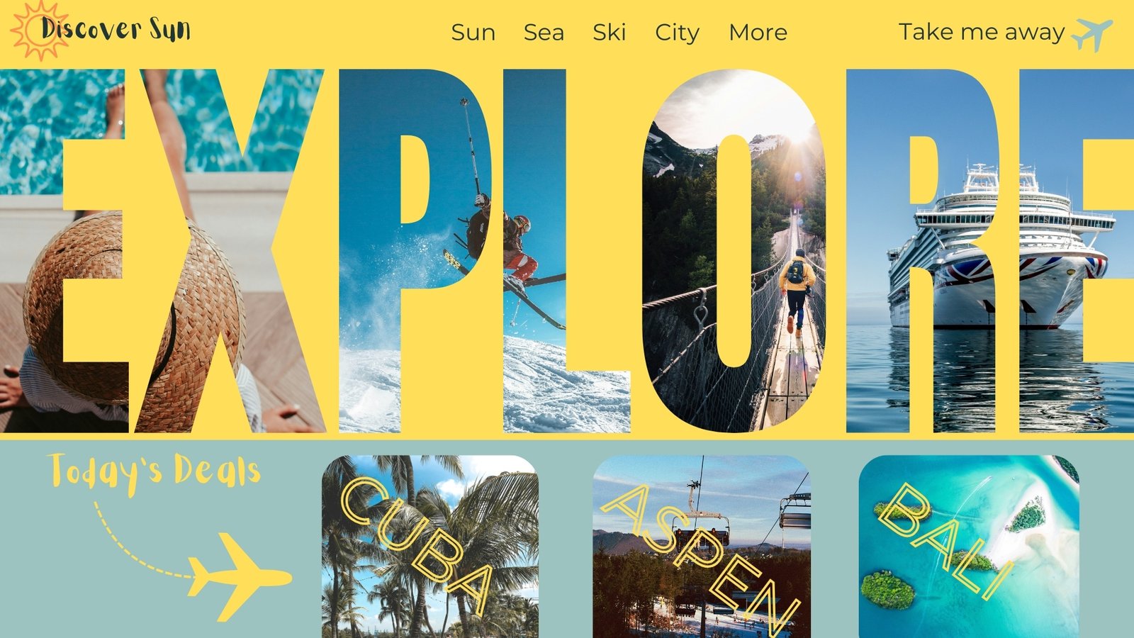
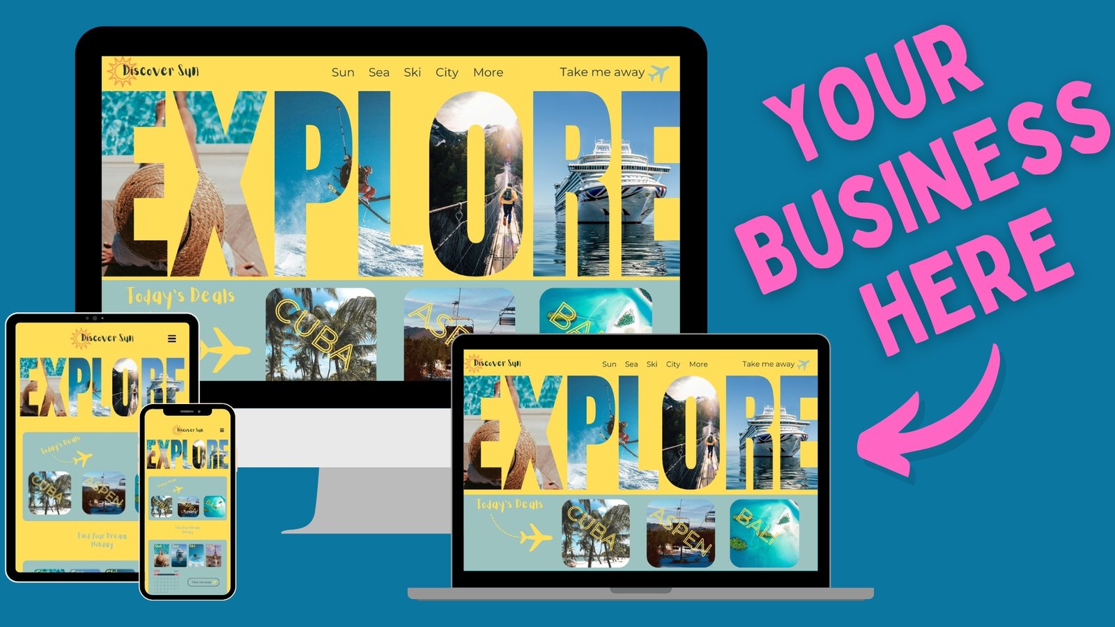
Discover Sun Travel
Inspiration
We wanted to immediately grab the attention of visitors and inspire them to find the escape, rest or play they deserve. By using the word ‘EXPLORE’ in such a prominent manner, we are not only engaging the customer but also providing the call to action they want to hear. Positively reinforcing their decision to visit your site.
Fonts
Aloja, Montserrat
Palette
Sun Yellow, Uranian Blue, Indigo
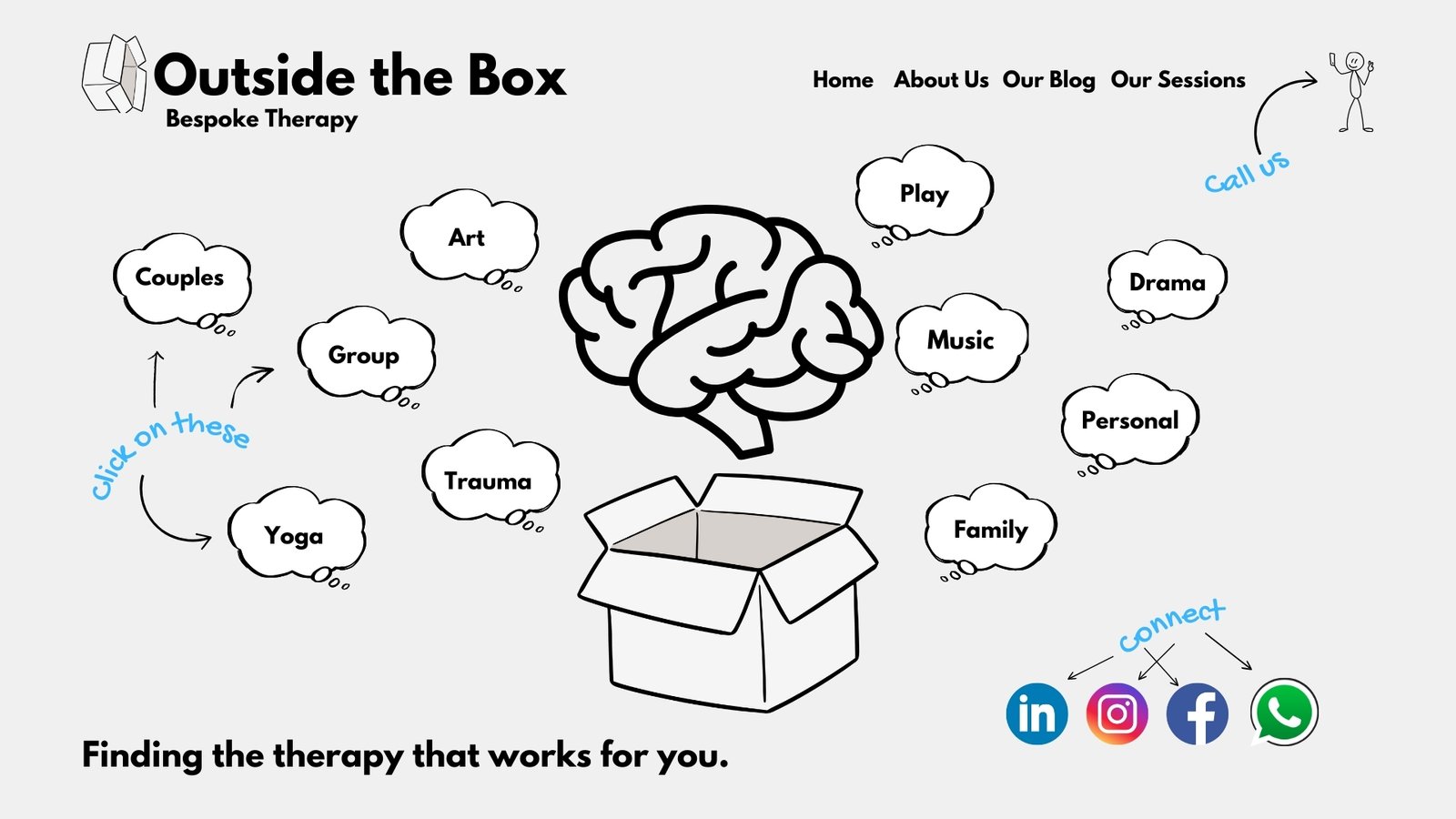
Outside the Box
Inspiration
The idea of therapy can be daunting to many and so we wanted to create a simplistic yet fun website to calm anxieties of visitors. The imagery we have chosen achieves this by showcasing the various styles of therapy whilst the stick man and hand font lighten the mood.
Fonts
League Spartan, Gochi Hand
Palette
Cloud grey, black and white with splashes of blue in the font.
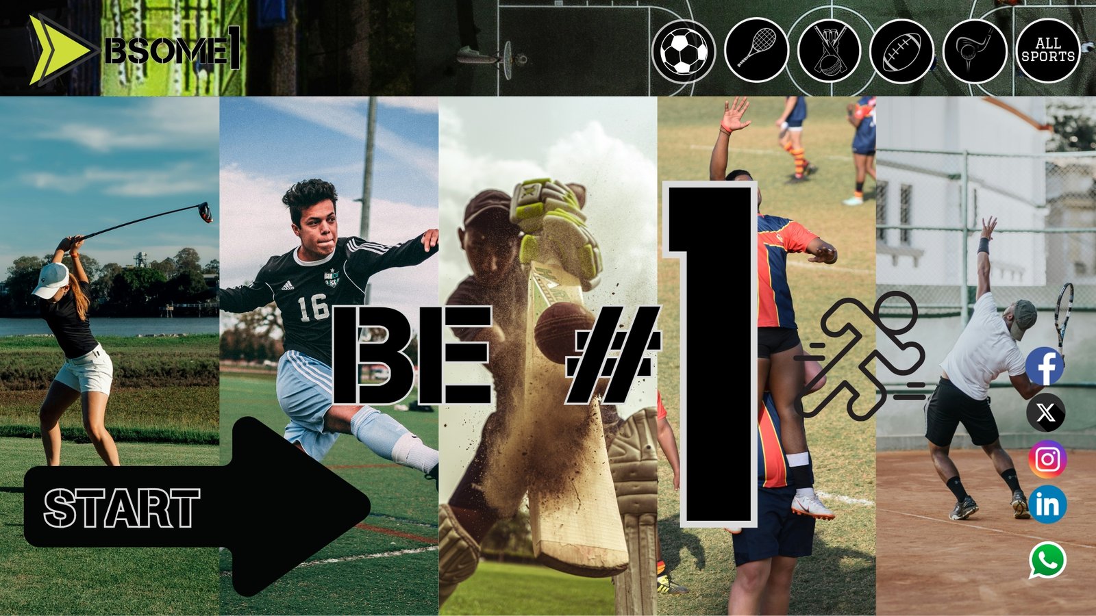
Be Someone Sports
Inspiration
This design was all about being active and encouraging others to follow suit. Using still action shots of a range of sports showcases the variety of choice for visitors to consider. The use of shades of green across the site represents the hallowed turf and the tagline of ‘Be #1’ reinforces their decision.
Fonts
Capture Smallz Clean, Graduate
Palette
Green Shades, Black and White
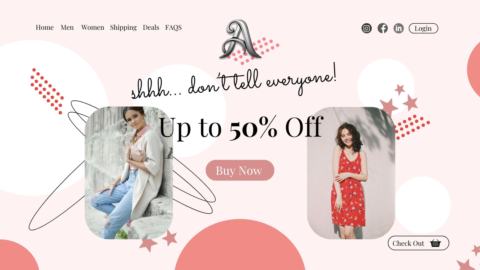
A Apparel
Inspiration
User Interface (UI) and User Experience (UX) is important on all websites but none more so than on an ecommerce site that is selling more than a product, it is selling a feeling. Our image placement allows the product to take centre stage, highlighting how a customer will feel if they make a purchase. Our use of the tagline ‘shhh… don’t tell everyone’ makes them feel specially selected for this gift.
Fonts
Playfair Display, Sacramento
Palette
Candy Red, Watermelon Pink, Crepe Pink, White
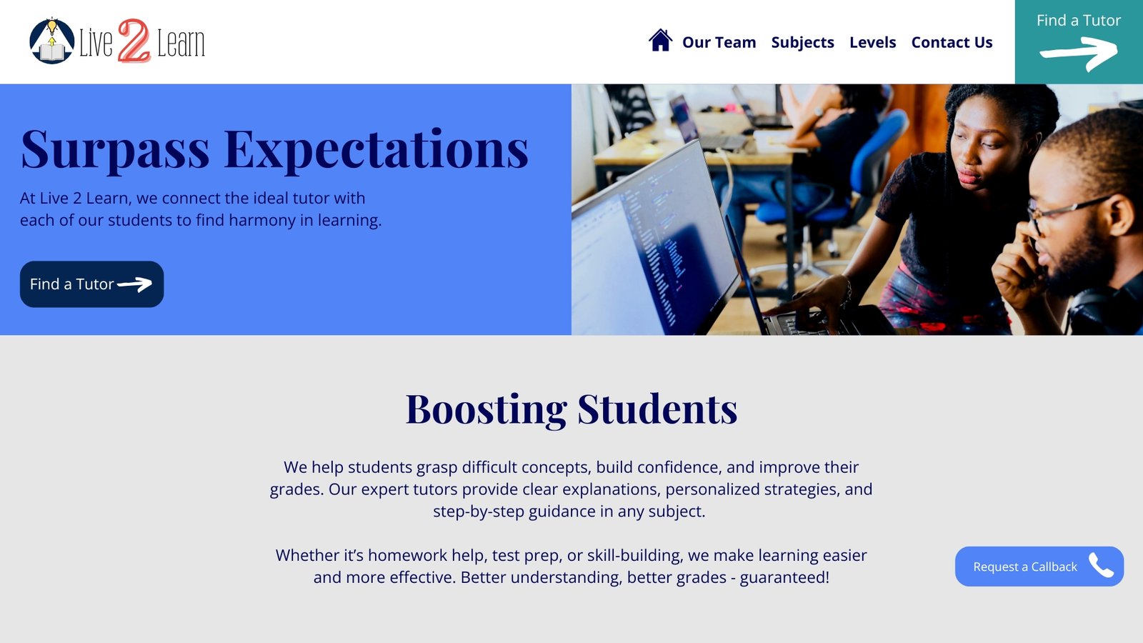
Live 2 Learn
Inspiration
As people often look for a tutor for an immediate start, we considered the most important factor of this website to be delivering a clear message quickly and easily guiding visitors on their journey to find the ideal tutor for them. We chose to include very clear call to action buttons highlighted with bold arrows to prevent any unnecessary delay.
Fonts
Playfair Display, Open Sans
Palette
Sky blue, grey and white
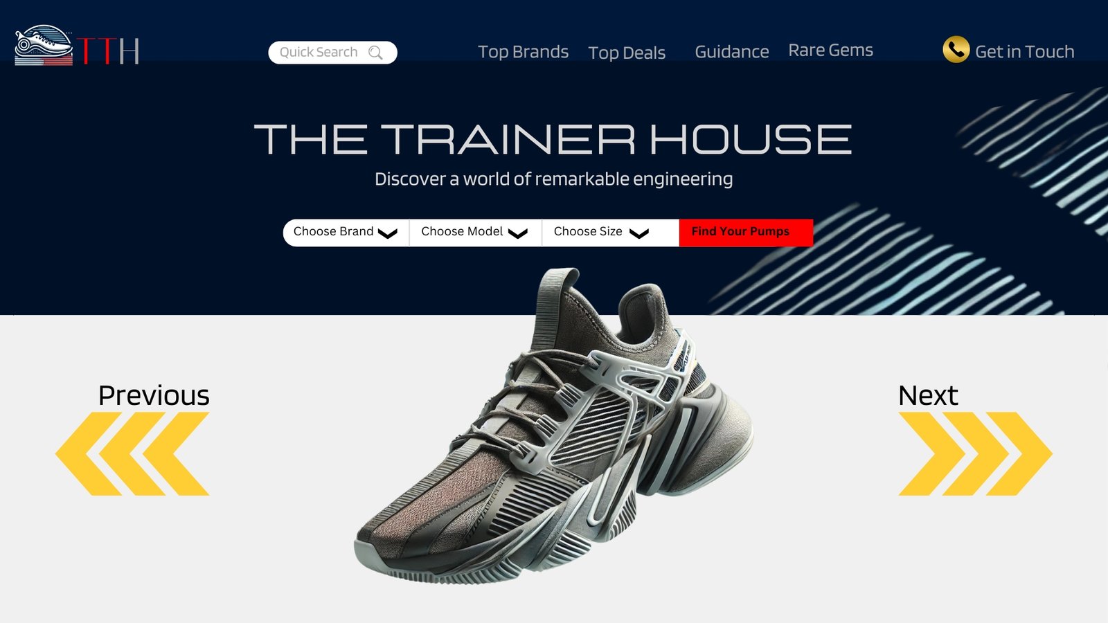
The Trainer House
Inspiration
A training shoe is not just footwear designed for sports. When designing this concept we wanted to include the demographic looking for the perfect fashion trainer and the world of collectors who hold the shoe to great esteem. This is what inspired us to create a website that presented each shoe as though it was the latest supercar!
Fonts
Lastica, Blinker
Palette
Deep Blues, Gold and Grey
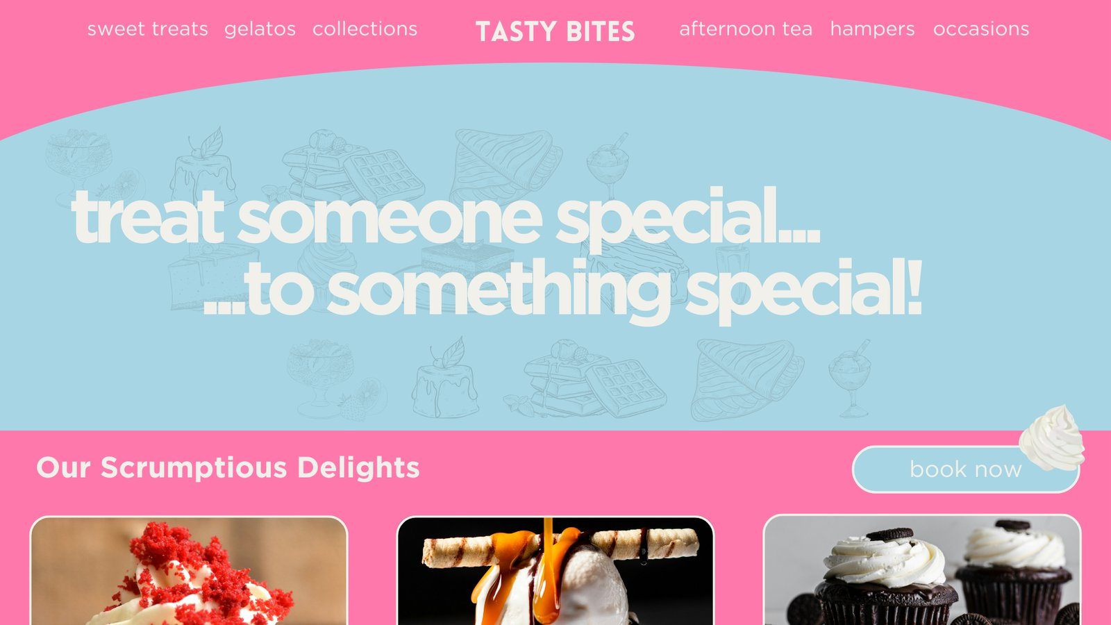
Tasty Bites
Inspiration
When we think about cakes, ice creams, deserts, doughnuts and all those sweet treats, we feel overcome with joy, and this was the feeling we wanted to capture with this website, engaging customers with images and colours they associate with happy moments. The double use of the word ‘special’ in the tagline reinforces the message the customer is in for a major treat!
Fonts
Lovelo, Gotham
Palette
Muted spray blue, bubble gum pink and daisy white
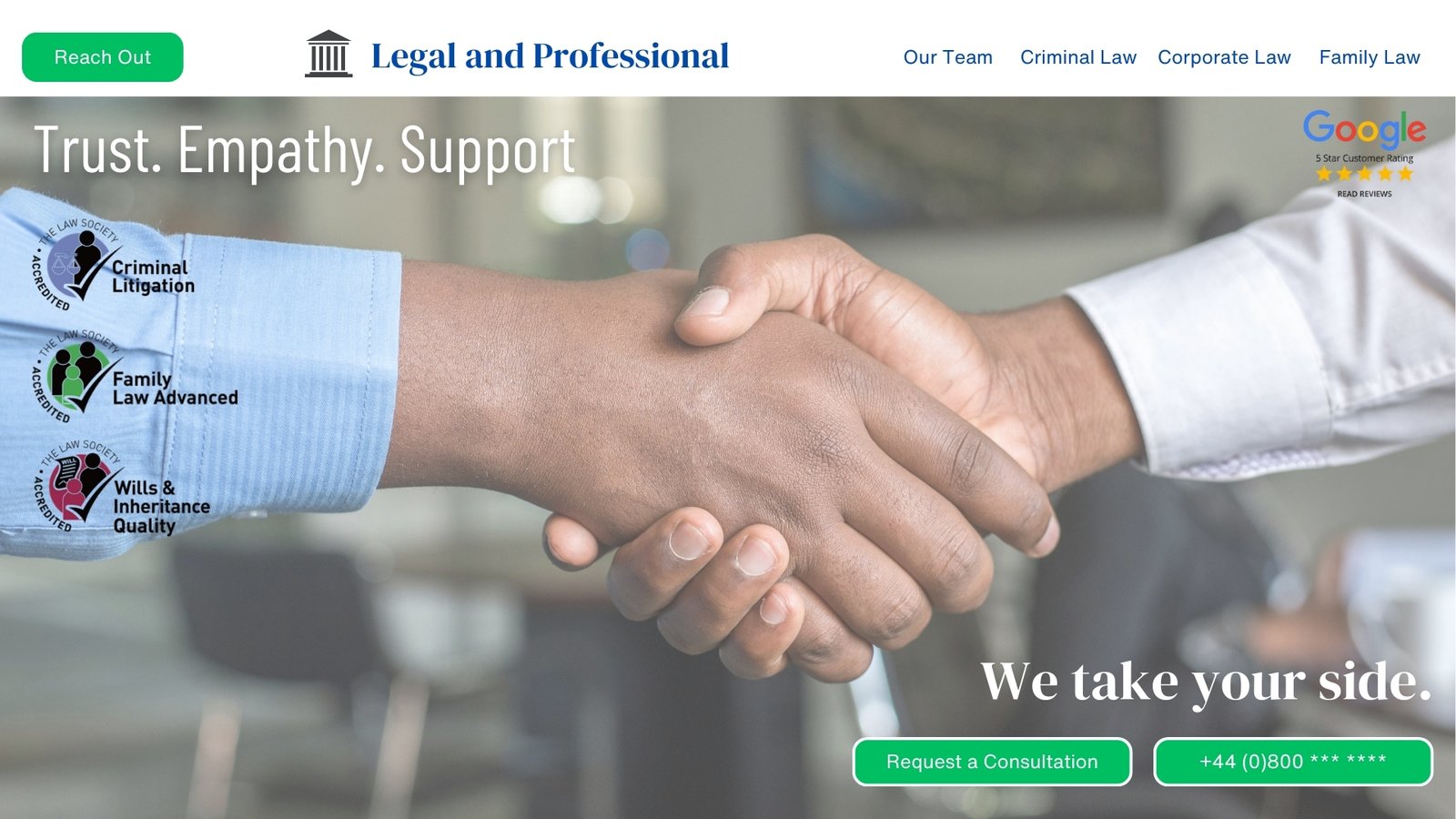
Legal and Professional
Inspiration
When it comes to an important factor that effects lives, a website must deliver the message efficiently, immediately and reassuringly. Using the main hero image of a handshake and showcasing industry credentials reinforces the message you will find professional support here. The word choice is designed to put the visitor at ease and the simple navigation crafted so as not to overwhelm.
Fonts
DM Serif Display, Helvetica Now
Palette
Blue. Green and white.
Site by Jamlis Web! :) © 2026